What makes a good logo? And how do you use it in your company branding? Many customers struggle with their company’s branding when making their name tags. A logo designed for use on the internet or printed media doesn’t typically look as well when you try to fit it onto a name tag.
Consider these few things assuming you already decided to use your company logo on your name tags.
What process will you be using to create them? A full color printed name tag can hold more colors and detail than a hot stamped one. Laser Engraving will limit possibilities even further.
Keep the size of the tag in mind. In most cases, logos will be much smaller than what you usually see, and little details won’t be as visible.
Remember that you may have to be flexible in the colors associated with logos. If you choose a yellow tag and your logo is yellow, consider changing it to black, so it shows up. If you select a hot stamped logo, colors are very limited. You may have to compromise with a basic shade of your colors.
When placing a logo to fill the allowable area on a name tag, the smaller the logo, the larger it can be. Consider using one or the other for logos that incorporate an image and text.
Remember that a name tag’s primary purpose is to convey a person’s name. So don’t make the names harder to read in favor of a bigger, fancier logo.
There are additional ways you can help logos look their best on name tags:
Try to limit the amount of detail in logos. Smaller sizes will not be visible. And many processes will have a hard time duplicating it. But, on the other hand, you only need enough detail to make logos recognizable.
Even if you generally use logos on the internet or printed materials, single color logos are best for name tags. Laser engraving and one color hot stamping need an image that is black and white. You can convert most logos into a single color image. But some will require extra effort to maintain the visibility of all logo elements.
Short and wide logos, such as a company name spelled out in fancy lettering, generally look best at the top or bottom center of the tag. Logos that are square or taller than they are wide will occasionally look good on the left or right side.
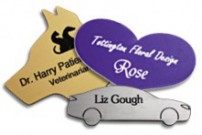
Another option you can consider to make your logo look its best on your name tag is to try a custom shape. Design your name tag with a shape that follows your logo, with an extra area to hold names and titles. Custom shapes are only available for laser engraved or hot stamped logos, but they can make any name tag stand out!
Hopefully, these tips can help you design your company name tags. In addition, they should give you a big forward step on the road to brand recognition!
These tips and graphics are provided by guest author Melanie Bunch, Graphic Artist at Coller Industries.


Thanks for the interesting read on some tips to keep in mind for a logo on a name tag. I’m glad that one of things you mentioned is to remember that original purpose of the name tag, and to make sure that you don’t have a big, fancy logo that can make the name hard to read. Honestly, this all sounds like a great creative opportunity to see what you can come up with. That being said, it definitely sounds worthwhile to maybe do some test runs with some designs and see what other people like.
Thank you, Taylor, for your thoughts on name tags and logos! Making sure your logo design works on a name tag is extremely important. Remember, “A logo designed for use on the internet or printed media doesn’t typically look as well when you try to fit it onto a name tag.”