What information should I include when designing my name tag? From font choice to details you think you should include, name tags are, surprisingly, an intricate thing when it comes to designing. And, making sure they read well is something you must consider before ordering one. Here are some guidelines to follow to make sure you are getting identification that helps your business.
Material & Color
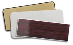
Durability is a must! We carry both high quality plastic and metal materials. So, no matter your new name tag use, we have a material that will fit your designing needs. And with 30 plastic colors and 18 metal color combinations, we have a color that will suit your business needs as well. But, remember what Scott Ginsberg, the Name Tag Guy, said:
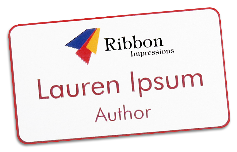
“The most effective background color for name tags is white. This allows maximum visibility for your logo, name and position. Dark blue, green or red backgrounds are used occasionally, but they have a tendency to ‘steal the show’ from the rest of your name tag.
“Write the font in black or dark blue. Never use yellow, orange or any other light color. Even if a dark color choice means an aesthetic digression, fashion must be outweighed by your name tag’s approachability and visibility! Finally, unless you work in an academic capacity, avoid gold name tags.”
Font Size & Style
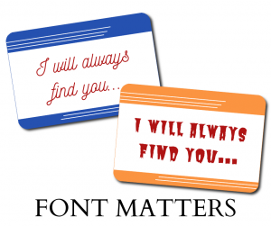
From size to the color, the font is one of the most important aspects of your new name tag. Yes, font matters when designing your new name tags! You should always choose a readable font and size. If others cannot read your name tag from at least 10 feet away, your font size is too small. However, don’t stray the other direction. Too large of a font will distract and limit, if not remove, space for additional information. Even if you are attending a horror convention, the name tag font should always be legible. If someone can’t read it, that negates the use of your name tag, so why even wear one?
Always consider the following: What does my font choice really say? Melanie Bunch, Coller Industries’ graphic artist, says, “Make sure you are using a font that suits your business or event needs. Even the tone of the font choice is essential. A bookstore or cafe might opt for a more casual font, while fine clothing or five star restaurants might want a fancier or more formal font. Large businesses and corporations may want to choose a font that is consistent with their company branding, which tends to be something more utilitarian.”
On the other hand, some fonts are always a bit more professional than others. We offer many font choices that are fun, yet maintain professionalism for nearly any business. And, remember that some fonts are great for employee names, but not suitable for a business name or title.
Engraving & Printing
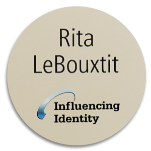
Before requesting any engraved (or printed) text for your new name tags, first, consider your size. Once you choose a name tag size, any names, titles or other information will then need to be tested to make sure they will appropriately fit. Shorter and smaller name tags may look better with your uniforms, but then you will most likely have to settle with first names only when designing. But, don’t think the larger your name tags, the more information you can have.
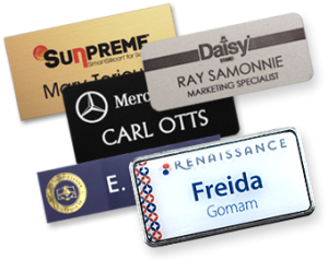
Once you have names, titles and your business name planned out, you can consider your logo. Always ask yourself, “Does this new name tag actually need my logo on it?” If the answer is yes, make sure to choose a name tag that best suits that logo. From engraving to full color printing we have a logo solution we are sure you will love.
The final guideline here is never to think your name tag is a business card.
There is a thin line between just enough information and too much when designing new name tags. Keep it simple, and keep it flowing. Yes, you need to represent the person wearing the name tag and in some cases, your business. But, remember that less is always more when it comes to name tags.
