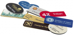
From conference to convention and every event in between, when it comes to your name tags, you should always KISS them. In other words, keep it short and simple. Simplicity is necessary to make your name tags work for you. And, avoid unnecessary complexity.
Professional tools such as name tags are essential in marketing and communication. They provide not only personal identity but corporate branding as well. Employees who wear name tags offer a sense of customer service and responsibility for that business. And, name tags are often the hardest working element to a person’s uniform in meetings, at conventions or during any event.
Here’s how you can and should KISS your name tags.
The KISS Principle
KISS, an acronym for “keep it simple, stupid” or “keep it stupid simple,” is a design principle noted by the U.S. Navy in 1960. The KISS principle states that most systems work best if they are kept simple rather than made complicated. The phrase has been associated with aircraft engineer Kelly Johnson. The term “KISS principle” was in popular use by 1970. Variations on the phrase include: “Keep it simple, silly,” “keep it short and simple,” “keep it simple and straightforward,” “keep it small and simple” or “keep it stupid simple.”
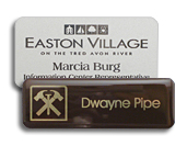
Whether you’re adding names and titles or logos and names, you should always remember the KISS Principle. Make sure your text is concise and to the point. Avoid longer titles unless necessary, and use an appropriate logo for your brand.
Remember that you should use the KISS Principle on your name tags as it is the most important thing you can do for them.
Yes, you should remember your branding by adding a logo to all of the name tags in your office. Or when creating name tags for a conference, add different company logos to each company’s name tags. Everyone will appreciate their branded name tags, and it also helps with continued recognition for each business.
For a name tag to be the most effective, there are guidelines to consider. The first rule is to keep yours simple. Some people treat them like business cards or resumes, but personal identification should be straightforward and concise. Name tags should only include the bare minimum information necessary to identify the person wearing it. In commercial and retail settings, that means the person’s first name, unless there is more than one employee with the same first name. With such cases, adding a last name helps with identification.
So, for branding to work on your name tags, you need only to include what is necessary. Whether you are gathering information for a convention or making new name tags for your office, only include the bare minimum.
According to Scott Ginsberg, the Name Tag Guy:
“How many times has someone rudely squinted at your chest desperately trying to make out those tiny letters? This is self defeating, embarrassing and actually works to decrease your approachability. Not to mention it makes the other person feel ridiculous! So, much like a retail price tag, your name tag must be readable from ten feet away — both the font and the name tag itself.
“According to a name tag survey done by David Alder of Biz Bash, 50% of a group of meeting planners claimed that ‘illegible font size of name tags was a major problem.’ And, consider the 75 million baby boomers that have reached, or will reach their bifocal days, this is a top priority. The recommended font size is 24 point – hopefully bigger if possible. Also, be certain to avoid cursive, script or other fancy letters.”
So, always remember to KISS (keep it short and simple) your name tags, and they will do the work for you. No matter what situation you are in, these KISSed tags are sure to get the job done.

